Hi there, welcome to our blog. This post is about my first experiences with the business analytic tool Power BI. I have been working with it extensively over the past few months and will share 2 cool features and a limitation solved with a work around.
Before this project, I was a freshman in the world of business analytic tools. This was my first project for Just-BI: exploring the pros and cons of Power BI while building a dashboard.
The first step was finding an appropriate dataset that can be used to build nice visualizations. On the site of Microsoft, some colleagues found a dataset named “Wide World Importers” (WWI). This is a dataset of a fictious company, including, among others: sales, order and geographical data.
The next challenge was getting this data into Power BI. We created a direct connection to the data model which was stored in Analysis Services. This gave us the advantage of a higher performance and the ability to refresh the data easily. However, we lost some flexibility since changes on the data model cannot be made in Power BI. They need to be made using Visual Studio instead.
Feature 1: Dynamical Drill-Down
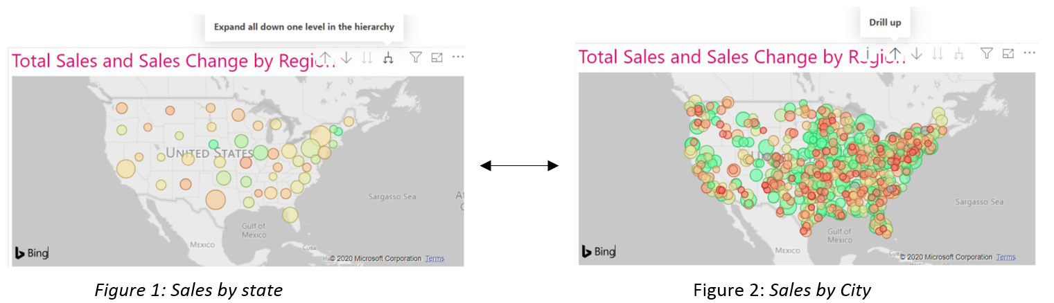
During my journey into Power BI, I was impressed by the possibilities of dynamically changing charts and interactivity between different components. There are multiple ways to filter and drill down or to display additional information by tooltips. The drill down option gives us the ability to change the level of a hierarchy dynamically, like in the example below.
Feature 2: Tooltips
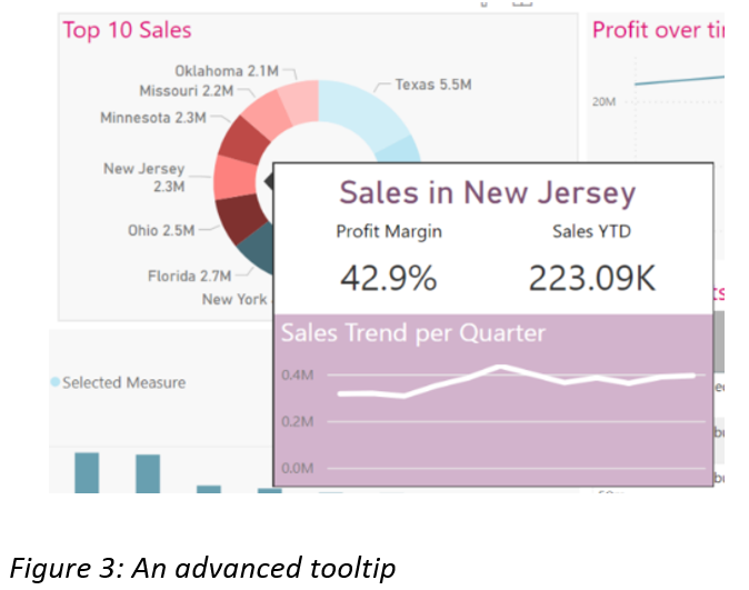
In addition, it is possible to create tooltips in Power BI which makes it possible to pop up some extra information if the user places his cursor on a certain category. This pop up shows additional information based on the category. It is even possible to create an advanced tooltip that shows multiple charts like the example below. In this way we’re able to display even more information within one dashboard.
Slicing on chosen measures or dimensions is not featured…
But do not worry, we found a way around it!
In Power BI, we can filter the data on multiple dimensions so that only the results based on a subset of the data are displayed. This can be done with the filter pane in the menu or simply by selecting a category on the axis of a chart. In addition, we can add a slicer within the dashboard itself, where the user can select a filter.
However, we may also be interested in changing the dimension or measures on the axis dynamically. Unfortunately, this is not supported by Power BI (whereas SAP Analytics Cloud does!). A feature that is often considered is using bookmarks, which is a tool that can hide or unhide a visual. This is often a time-expensive solution if multiple measures and dimensions must be displayed for a certain chart. Fortunately, there is another approach that can save us a lot of time. I will explain this method in 3 steps, including an example.
Question: How can I switch between dimensions on the x-axis dynamically? (e.g. change the dimensions Stock Item and Country dynamically)
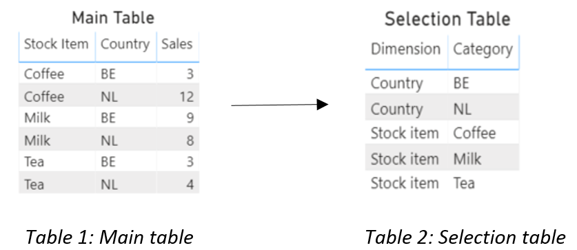
Step 1. Create a new table with 2 columns. The first column includes the title names of the dimensions. The second column lists all unique values of the corresponding dimension.
Example step 1:
Step 2. Create a new measure which treats the selected dimension as the corresponding dimension of the main table.
Example step 2:
Sales =
IF (
HASONEVALUE ( ‘Selection table'[Dimension] ),
SWITCH (
VALUES ( ‘Selection table'[Dimension] ),
“Country”, CALCULATE (
SUM ( ‘Main table'[Sales] ),
TREATAS ( VALUES ( ‘Selection table'[Category] ), ‘Main table'[Country] )
),
“Stock Item”, CALCULATE (
SUM ( ‘Main table'[Sales] ),
TREATAS ( VALUES ( ‘Selection table'[Category] ), ‘Main table'[Stock Item] )
)
)
)
Step 3. Create a new chart, placing your newly created measure on the y-axis and on the x-axis the ‘Category’ column of your selection table. Afterwards you can create a slicer based on the ‘Dimension’ column of the Selection table.
Example step 3:
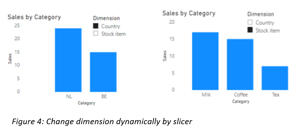
Congratulations! Your chart will change dynamically by the selected dimension on your slicer.
There are of course still many features and possibilities to discuss. However, I will not do that today. Instead I will continue to explore Power BI and other analytic tools.
Thank you for reading this blog and please, feel free to comment.