In the first blog about SAP Lumira 2.0 you got the highlights of new features in the new SAP Lumira 2.0 Designer (see All you need to know about SAP Lumira 2.0 Designer fka SAP Design Studio). Now in this the second of a series of deep dives on the features of SAP Lumira 2.0 Designer, you will get to know how to make your application responsive. Responsive (web) design is the approach that requires the design and development to dynamically respond to screen size and orientation of different (mobile) devices. Executed correctly, this eliminates the need for distinctive designs and developments for different device use-cases, e.g. desktop and mobile. Nowadays, this is a very common request when working on dashboards and reports. Though you can set auto height and auto width in SAP Design Studio applications, this will only take you so far. This workaround could never really cater all screen sizes and could not cope with changing screen orientation. Other workarounds involved a non-standard way of working in CSS or SDK extensions. Now with SAP Lumira 2.0 Designer’s new component “Adaptive Layout” you can implement a responsive design right out of the box without tinkering in CSS or with SDK extensions!
The “Adaptive Layout” component acts like a responsive UI container and provides options to allow components to adjust to screen resolutions and orientation. This is done by having the content inside of multiple smaller child containers called “Blocks” instead of in one large container. So, the screen can be dynamically build up by (re-)arranging these blocks of content during start-up or if the screen orientation changes (see Figure 1). This is how a SAP Lumira 2.0 application becomes responsive!
Figure 1: Example of how the blocks are re-arranged for every defined screen size i.e. Viewport

In general, the application need to know When and How to rearrange the blocks:
- The When is handled by means of thresholds for switching between screen sizes. You define thresholds in terms of minimum width per screen size.
- The application knows How to rearrange since the screen has a certain space available and all the blocks have a certain width specified by you. Thus, the application will try to fit as many blocks in the available width space working from left to right.
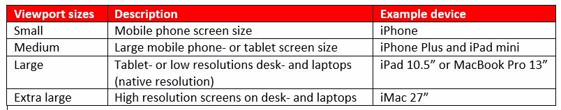
The Adaptive Layout component distinguishes four discrete screen sizes called “Viewports”. Each viewport can be assigned to a certain use case e.g. mobile phone and desktop. Three thresholds called “Minimum Width” of a viewport can be set to trigger the switch between these four viewports. The property value for this “Minimum width” reflects the number of pixels.
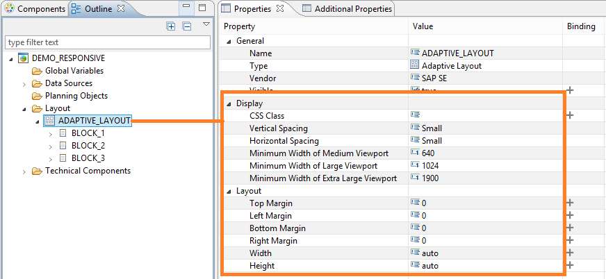
Other relevant settings are the layout properties Width and Height, which you need to be set to “Auto”. Margin properties can be set accordingly.
Figure 2: Thresholds for viewports’ minimum width and layout settings
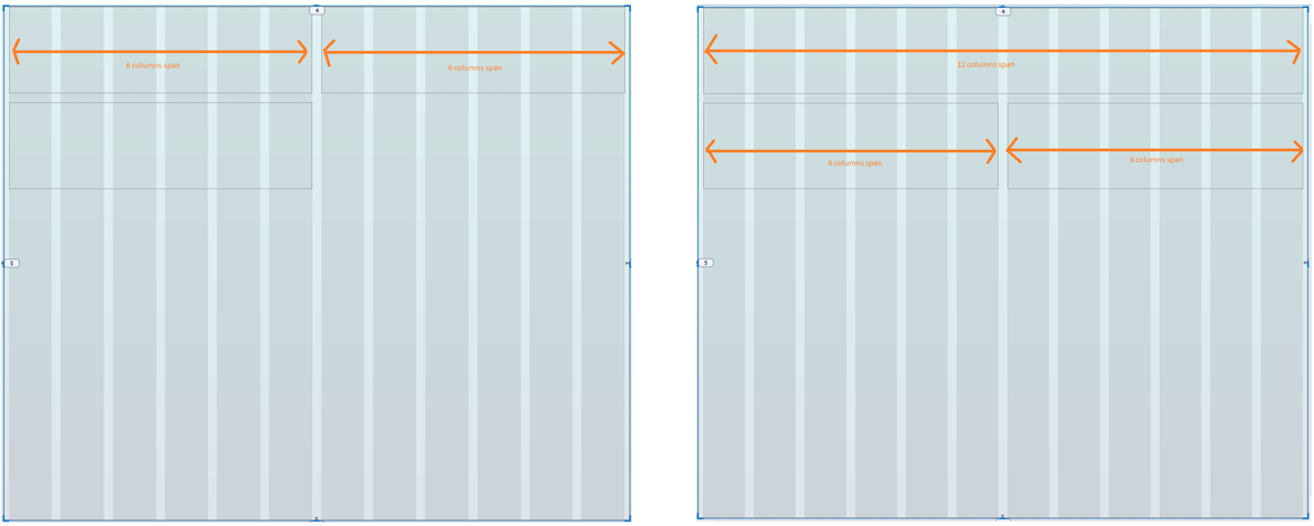
When a threshold triggers a switch during runtime, the component will try to fit as many blocks in the available width space available working from left to right. The available space is divided in 12 columns irrespective of the number off pixels. The application knows How to allocate the blocks since each block has a required column span defined. For example, if block 1 and -2 both require a column span of 6 totaling 12 columns, the two blocks will be placed next to each other (see Figure 3 left picture). But if block 1 requires a column span of 12, block 1 will already occupy the full width and the next block will be located below block 1 and so on (see Figure 3 right picture).
Figure 3: The viewport’s width is divided in 12 columns
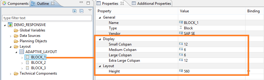
The only layout property that can you can set for a block is the Height. Thus the responsiveness of the component is limited to changing the arrangement of and the width of the blocks, but the height remains a fixed value. There also is no scripting function you can use to set this value.
Figure 4: Column span settings in Block’s properties and layout setting
Summary:
The Adaptive Layout is a nice and welcome feature with the explosion of mobile devices and mobile analytics. This trend is already a couple years on its way so SAP is finally catching up in this respect. Nevertheless, this feature in SAP Lumira 2.0 Designer really simplifies the implementation of a certain level of responsiveness opposed to “hacking” into CSS and using SDK extensions from third parties. Though CSS can provide a higher level of responsiveness and can cater more complex components like picture scaling or dealing with cross tables (e.g. readability when zooming out), it requires more effort compared to this standard component. This is a consideration you should make on a per case basis and depends on the available CSS skillset in your project .
This article belongs to
Tags
- Adaptive layout
- Just-BI
- Lumira
- SAP des
- SAP Design Studio
- SAP Lumira
Author
- Jason Lee
