Like a lot of Business Intelligence (BI) specialists, we’ve been fascinated by the volume and variety of dashboards that the COVID-19 crisis has produced. There has been some really great examples of good design and functionality. (For a nice overview of some of them check out https://covid19dashboards.com/)
It’s also been great to see how many good data sets have been made publicly available to drive this wave of creativity. (Big shout out to John Hopkins, whose COVID-19 data sets have become a central driver for countless efforts.) In this vein, we wanted to share a very interesting data set from Oxford University that is publicly available and updated daily (so you can link it with your data warehouse by overlaying the regulations data set).
While a lot of the COVID-19 data sets are understandably focused on the epidemiological aspects of the crisis, this data set, the Oxford COVID-19 Government Response Tracker provides insights into government policies and interventions in the fields of containment and closure, economics and health systems. Oxford University has been systematically registering the COVID-19 government responses worldwide, collecting them from publicly available sources. While acknowledging the difficulties in nuance and heterogeneity, it has come up with a list of almost 20 indicators. The main measure is the Stringency Index, which looks at different country lockdown and closure regulations and measures their stringency, or strictness, on a scale of 0 (no lockdown) to 100 (total lockdown). Data is available as from the beginning of the pandemic and will be updated during the crisis. It is online and free available at http://www.bsg.ox.ac.uk/covidtracker.
A uniform measure of the different lockdown policies being pursued by various governments opens up a whole range of social and economic comparisons.
We took advantage of the opportunity and together with one of our customers we combined the available supply chain actuals and forecast data with the Oxford COVID-19 data set. For this retailer we specifically looked at sell-in and sell-out sales data. With the forecasting sales data coming from the customer’s demand planning, we were able to evaluate forecasting accuracy against actual sales volumes on different country and product levels. So far, the timing and the stringency itself show clear relations in initial sales peaks and a higher sales volume after stabilization across nations. The following graphs provide a closer look at this data.
Print Screen 1: Sell-in & COVID-19 Stringency data:
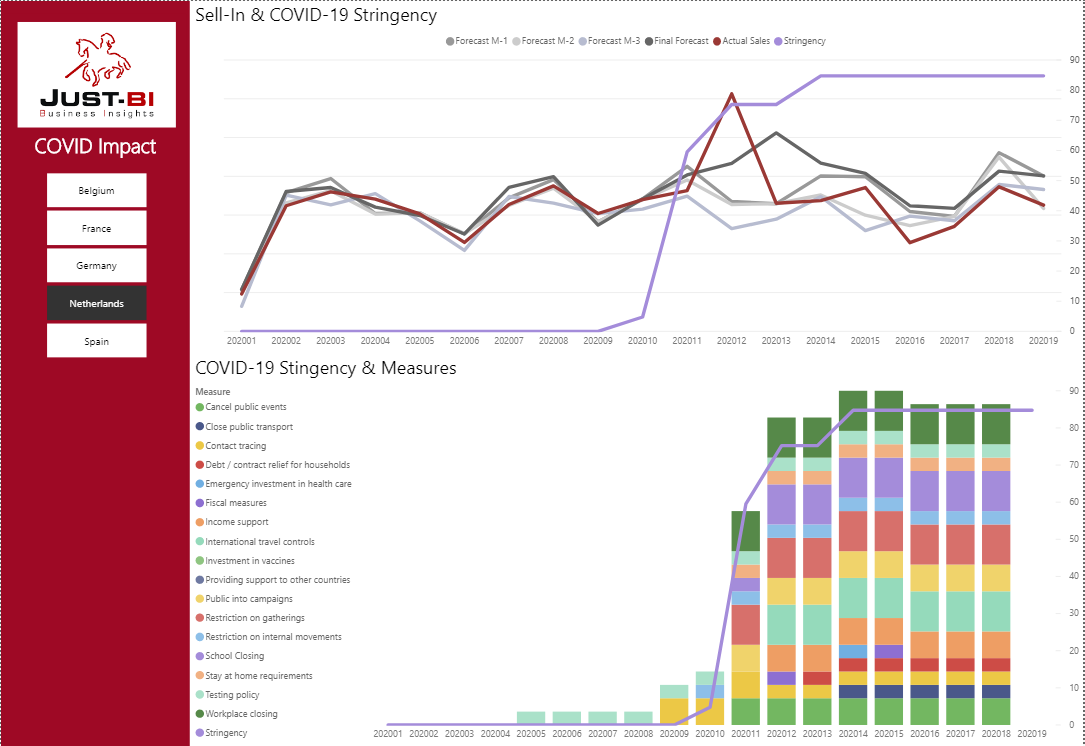
Print Screen 1: Sell-in & COVID-19 Stringency data
First Graph: This represents Sales Volume (red line) and various Demand Planning Forecast angles (Black/Grey lines)
Let’s take week 12 as an example, as this is the week that clearly stands out as the ‘hoarding’ week with a big red spike in sales volume as a result of the COVID-19 measures(blue line) imposed by the Dutch government. (in week 12 the Intelligent Lockdown became active)
After ‘hoarding’ week 12 we see that the Final Forecast is raised significantly for week 13, however the sales volume dips quite hard, recovering slightly in week 15.
The Final Forecast remains too high in weeks 14 and 15, suggesting possible overproduction and/or increased stock levels.
Second graph: This provides more insight into the specific Covid19 measures imposed by the Dutch government, such as school closing, restrictions on movement, workplace closing, etc.
Print Screen 2: Sell-in & COVID-19 Stringency data for the digital sales channel:
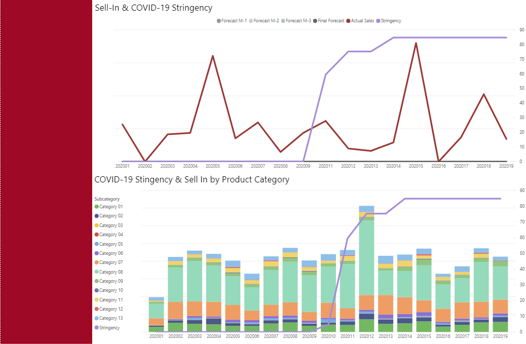
Print Screen 2: Sell-in & COVID-19 Stringency data for the digital sales channel
First graph: If we zoom on the digital sales channel, we notice quite a different pattern. As the stringency increases, we don’t see an immediate spike in digital sales volume.
However, we do see that in week 15 there is a clear increase in digital sales volumes.
It would be interesting to find out if perhaps consumer sentiment survey results contain some information that indicates that consumers are indeed slightly shifting to the online channel.
Second graph: This provides a break-down of the digital sales volume per product category and subcategory, showing clear dominance for one of the products.
We are looking into including sell-out data into the model, which comes from two sources: survey data on consumer sentiment and a Nielsen data set which gives us a bit more granularity on purchases over time. By bringing these two datasets together we will have a chance to evaluate, assess and validate the data quality being brought in by the local market surveys.
Functionally, we have thought through how the data model is going to receive the sell-out and consumer sentiment data. We identified the linking measures (time and country) to be able to bring these in and display them side by side. This merge will allow us to spot the differences between retailer demands and consumer demands, and evaluate how these two reflect on each other, considering the shopper’s mindset as well.
Since the hoarding behavior was mitigated by a steady supply, it’s safe to assume that future cycles will be different. Nevertheless, stay-at-home restrictions will make some shoppers nervous of public exposure to the virus and thus eager to avoid frequent trips to the shops. Therefore, we could reasonably assume that a spike in sales can be expected whenever such restrictions are implemented, as consumer mentality will at least temporarily trend towards bulk purchases instead of day to day restocking. It is possible that future spikes may not be as noticeable as in the current cycle, but they could remain considerable, nonetheless. Furthermore, the possibility of a second wave is becoming more probable, as we infections rates rising again in countries that have lowered their stringency index such as China and South Korea.
In order to combine the different data sets, we extracted and transformed the data from internal and external sources to the same granularity and timelines. We identified the linking measures (time and country) and thought out the data model. By making use of direct API connections to the external data sets, new data is being included automatically as soon as it becomes available. Also, the logic that we developed for the data model and the dashboard has created a flexible and future proof solution for our customer.
If you enjoy mashing back-end data and designing smart front-end visualisations, you should be able to create the data models and manage the data sets that will reveal hidden gems in the data. Of course, the whole exercise depends on how well you know the business, and in this respect the high level of trust we’ve built with this customer over the years of deep collaboration was critical to us being able to quickly identify and explore the internal data sets.
We hope this brief overview of our work on this COVID-19 project inspires you and your stakeholders to do some of your own BI exploration!
Below you can find the interactive dashboard of the above print screens.
Many thanks to the following members of the Just-Team for contributing to this article:
– Gabriel Garcia for the data mashing and creating the dashboard
– Viveca Cohen for analyzing the content and giving insights
– Luke Disney for wordsmithing the article
– Patrick Pronk for guiding the process